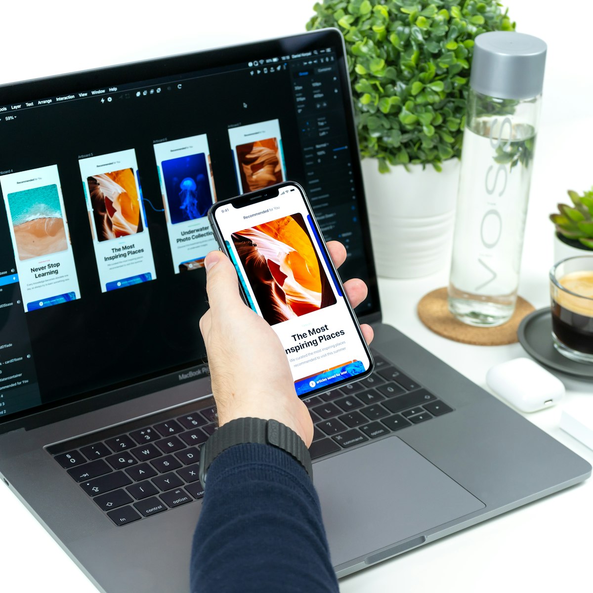
Designing Intuitive User Interfaces: Principles and Practices

Designing Intuitive User Interfaces: Principles and Practices
An intuitive user interface makes the difference between an app users love and one they abandon. This guide explores core principles of intuitive UI design and practical techniques for implementation.
Understanding Intuitive Design
Intuitive interfaces feel natural because they:
- Align with users' mental models
- Leverage existing patterns and conventions
- Minimize cognitive load
- Provide clear feedback and affordances
Core Principles of Intuitive UI Design
Consistency
Consistency creates predictability:
- Visual consistency (colors, typography, spacing)
- Behavioral consistency (interactions work the same way throughout)
- Platform consistency (following platform conventions)
- Brand consistency (alignment with brand values and aesthetics)
Clear Hierarchy
Strong visual hierarchy guides users:
- Size and weight variations to indicate importance
- Strategic use of color and contrast
- Thoughtful spacing and grouping
- Purposeful layout that follows natural eye movement patterns
Feedback and Affordances
Users need to understand what's happening:
- Visual feedback for all interactions
- Clear affordances that suggest how to interact
- System status visibility
- Error prevention and clear error recovery
Progressive Disclosure
Reveal information gradually:
- Show only what's needed at each step
- Layer complexity behind progressive interactions
- Use expandable sections and drill-downs
- Balance discoverability with simplicity
Practical Techniques for Implementation
User Research and Testing
Base decisions on user needs:
- Conduct usability studies to identify pain points
- Create and validate user personas
- Map user journeys to understand context
- Test prototypes iteratively
Design Systems
Codify your UI elements:
- Build a comprehensive component library
- Document usage guidelines
- Establish pattern consistency
- Enable team-wide alignment
Micro-Interactions
Add delight through details:
- Subtle animations to reinforce actions
- Transitional effects that maintain context
- Personality-infused responses
- Purposeful motion that guides attention
Accessibility as Intuitiveness
Accessible design is often more intuitive:
- High contrast for better readability
- Larger touch targets for easier interaction
- Clear labeling benefits everyone
- Keyboard navigation as an alternative input method
Great UI design isn't about flashy visuals but about creating interfaces that fade into the background, allowing users to accomplish their goals without frustration. By focusing on these principles and techniques, you can create apps that feel natural, satisfying, and intuitive to use.

Olivia Scott
Author at Nazca. Passionate about creating exceptional mobile applications and sharing knowledge with the developer community.
